Identity · Shasha Post · 27 Oct 2026
A screen, and the three dots of someone writing.
شاشة, shasha, is Arabic for a screen. The mark is the word’s first letter, ش, written inside one: three teeth for the sound “sh”, and over them three dots, the dots every screen shows while someone is writing to you.
01
The name
Shasha is the Arabic news site’s own name, and the English edition keeps it whole: “Post” says what it is, a place where news is posted, and the Arabic says where it is seen.
ش is the letter for “sh”. A reader of Arabic sees the first letter of the name; a reader of English sees three dots over a soft “w”, which is how the brand introduces itself: the dots first.
02
The mark
Drawn on a 100 unit grid. The tile is a superellipse (exponent 5): its corners run into the sides instead of meeting them, like the glass of a phone. The three teeth stand 27 apart and join in two half circles of radius 13.5; the stroke is 10, with round ends. The dots are 6.2 in radius, one over two, the triangle a written ش makes.
Under 24 px a small cut takes over (favicon, tab): heavier teeth at 13, dots at 8.2, so the letter survives at 16 px.
03
The dots
The dots are the brand’s grammar. They carry state, and they are the only thing on the site in signal orange.
Writing
Three dots in a row, hopping. A story still being written: live pages, live labels, the status bar.
Posted
The dots settled into the letter, one over two. Section heads, “Just posted”, the end of every story.
Reading
On a story page the masthead’s dots light one by one as you read: a third, two thirds, the end.
Off
A dark screen with its dots and no letter stands in for a photo that does not exist. It never pretends to be one.
04
Wordmark
Familjen Grotesk at 700, shaped with its own kerning and tightened 2.8%, then drawn as outlines. The tile is 1.42 cap heights tall and centred on the capitals; the gap is three tenths of the tile. “Post” takes the screen’s cobalt. Keep clear space of one tile height around it; do not set it under 96 px wide.
05
Colour
Cobalt#1E2BD2
The screen, switched on. Tile, links, the reading bar, the live band.
Signal#FF5A36
Only the dots: what is new, what is live, how far you have read.
Ink#0B0E1C
Text, the status bar, the dark screen of the culture band and footer.
White#FFFFFF
The page. Never cream, never paper.
Mist#F1F3F8
A cool grey for panels: “Just posted”, sources, the Daily Post.
Cobalt on white is 9.0:1; ink 19.2:1; secondary ink (#394057) 10.3:1; meta (#5E6680) 5.7:1, and 5.1:1 on mist. Signal orange is never text on white; where it must speak it darkens to #C2361A (5.5:1). With the lights off the page is ink, links lift to #9DACFF, and the tile stays cobalt.
06
Type
Familjen Grotesk
Settlers set up an outpost north of Ramallah
Headlines · labels · times 14:32 · 27 Oct · ₪3.74
Faustina
Faustina was drawn for long reading on screens. It carries every story, at 19.5 px with a line of 1.65, and its italic sets the quotes.
Familjen Grotesk (Familjen STHLM) for everything that speaks: its single-storey ɑ is a small rounded screen, so “Shasha” sets as two of them. Faustina (Omnibus-Type) for everything you read. Both are open source, self-hosted as WOFF2 subsets (20 and 29 KB).
07
Photographs
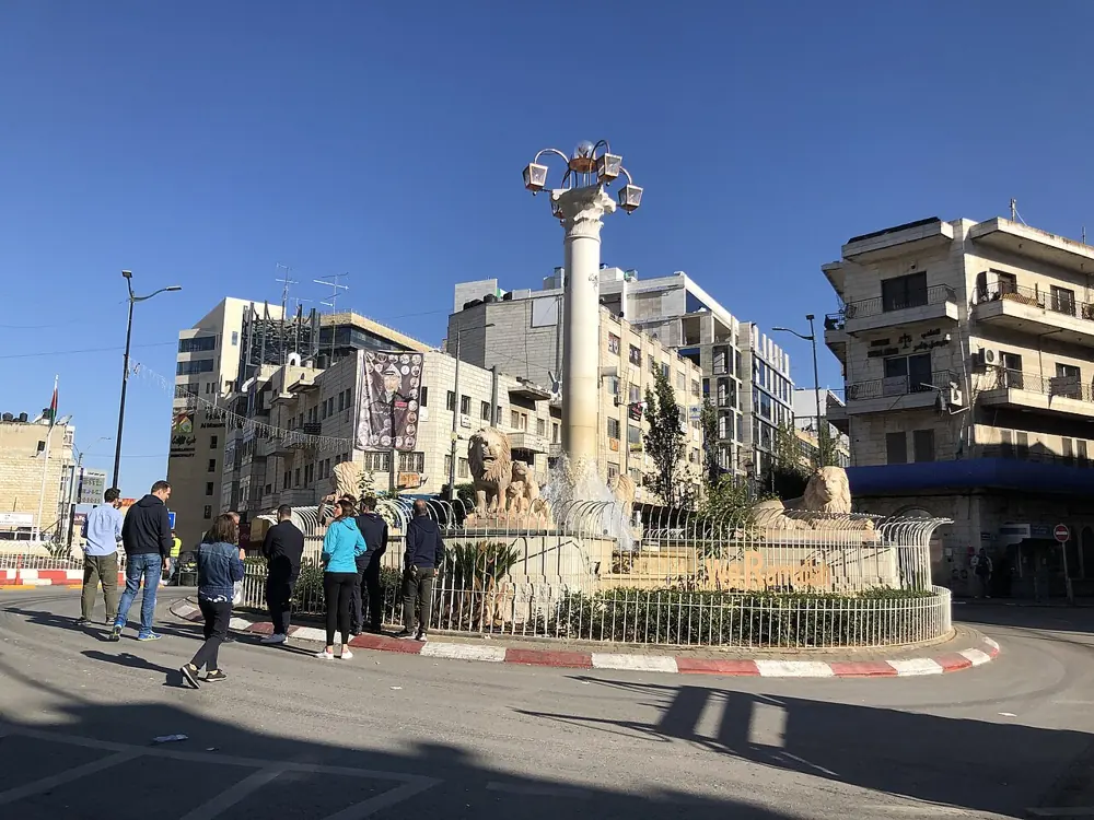
Photographs are screens: the same continuous corners, in their own colour, never tinted. As a photo enters the view it switches on, a line of light opening into the picture. Every photo shows the place, the person or the thing the story is about, with a caption saying what, where and when. Where no honest photo exists, the dark screen with its dots stands in.
08
Motion
- The loader, once a visit: a line of light opens into the screen, three dots type, then settle over the teeth as the letter is written, and the tile flies to its place in the masthead. See it.
- Switching on: photos open from a line, 0.75 s, ease out.
- Writing: dots hop 3.5 px, 1.1 s, staggered 140 ms.
- Reading: a cobalt bar and the masthead’s three dots.
- Pages cross-fade with view transitions. With reduced motion everything is still and immediate.
09
Don’t
- Don’t use signal orange for anything but the dots.
- Don’t redraw ش with real calligraphy or add its tail: the mark is the letter as a screen writes it.
- Don’t put the mark in a circle or a sharp square, or outline it.
- Don’t tint photographs blue, or put text on them.
- Don’t invent staff, readers, partners or numbers.