What you approve in the design is what ships.

I’m Islam Nasser, UI/UX and front-end team lead at TakTek. I plan the flows, design the screens and the components behind them, then write the code myself. Seven years of it, in Arabic and English.

mo3ta.ps
Mo3ta on a laptop
Mo3ta on a phone
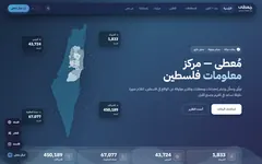
mo3ta.ps on a laptop and a phone

Five projects I designed, and four I built.

Each one starts with what was actually hard and the decision that followed. The three sites and the 3D twin are shown live, captured in September 2026, on a laptop and on a phone, and the app from its Figma file. Results go only as far as they can be checked.

Mo3ta معطى

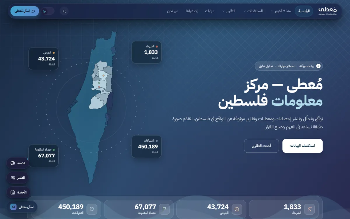
Palestine's statistics in one place: dashboards, a map and charts over a large Arabic dataset. A journalist, a researcher or a student should be able to find a number, see it in context and cite it.

Role
UX and UI design, then the whole build
Focus
Numbers in Arabic, map and chart components, server rendering
Built with
Vue 3 and Inertia with SSR, on Laravel
A 12-second intro made from Mo3ta's own logo, colours and map outline. Its middle beat is the case's rule: a number arrives with its date and its source.
mo3ta.ps/daily
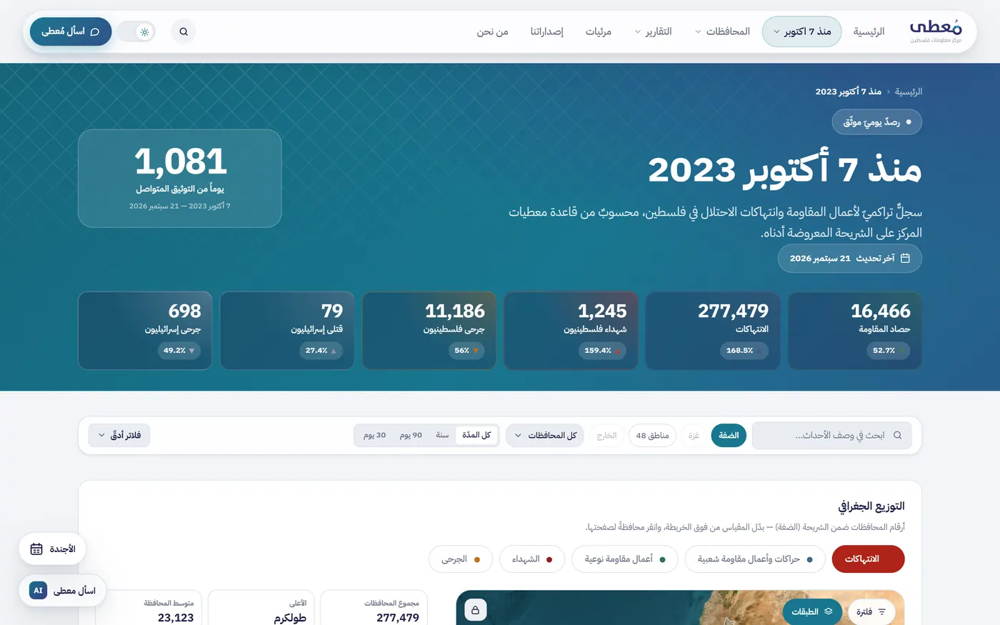
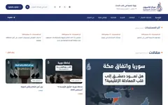
Mo3ta's daily dashboard in Arabic: six headline counts, a search field, region and period filters, and the top of a map.
The daily dashboard. Region, period and governorate filters sit above the map, and the date of the last update is in the header.
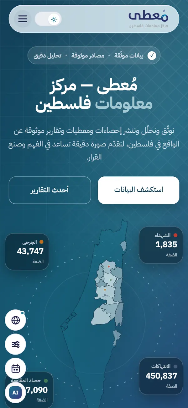
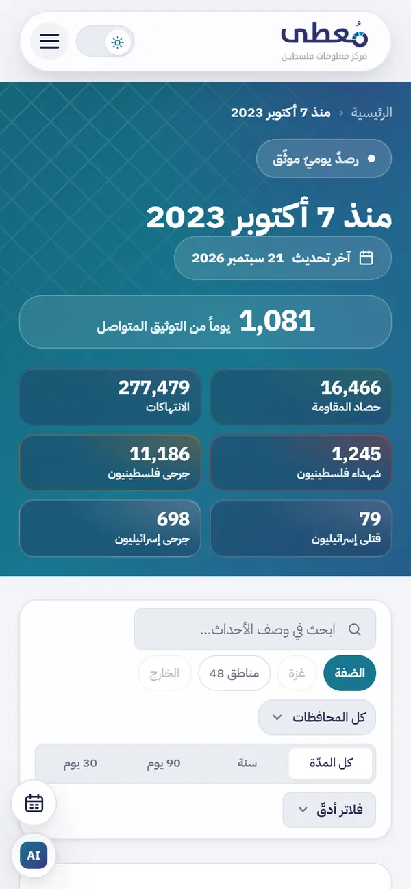
Mo3ta's home page on a phone: a map of Palestine with four headline counts placed around it.
The home page at phone width. The map stays in the middle of the screen.
The daily dashboard on a phone: counts in two columns, then search, region chips, a governorate menu and period tabs.
The same dashboard on a phone. The counts drop to two columns and the filters stack under the search.

The decision. Keep everything around the data quiet so the map and the charts carry the colour, and never show a number without its date and its source.

Where the numbers were

Before this, the statistics lived in PDFs and spreadsheets. The centre wanted one place where a number could be found, seen on a map or a chart, and cited.

Why every page renders on the server

A figure that search engines cannot read is a figure nobody finds, so a client-only dashboard was ruled out early. Pages are rendered on the server with Inertia and arrive as real HTML, and Vue 3 adds the interactive layer on top.

One component set for every figure

The map and the charts are one reusable set, fed from the same indicator model, with export and share on each figure. They use the same tokens as the marketing pages, so the product and the site look like one thing.

Numbers, in Arabic

Figures sit on a monospaced scale so they line up in columns. The layout runs right to left throughout, and the axes and legends are placed so they still read naturally that way.

Result

  • Live at mo3ta.ps, with the indicator library, the map and the dashboards in production.

Devlo CMS ديفلو

One Laravel application runs 24 news and media sites, most of them in Arabic, each with its own theme, modules, languages and editorial team. I designed the editorial panel and the theming model, then built both.

Role
Design and full-stack, product owner of the front-end
Focus
Theming model, a panel in three languages, guard rails
Built with
Blade, Livewire and Alpine on Laravel; MySQL, Redis
A 15-second intro made from six of the sites' own front pages. Its middle beat is the case's decision: one frame takes on three other sites' themes and languages while the modules and the code stay put.
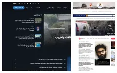
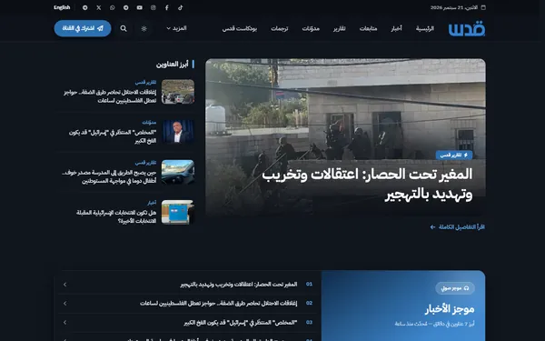
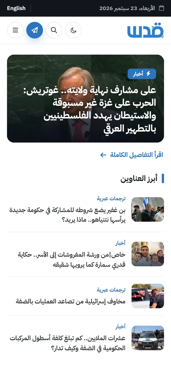
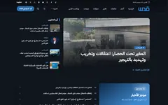
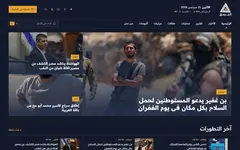
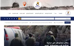
  • Quds News Network front pageQuds News Network قدس الإخبارية
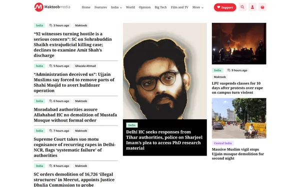
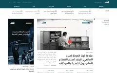
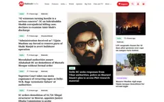
  • Maktoob Media front pageMaktoob Media
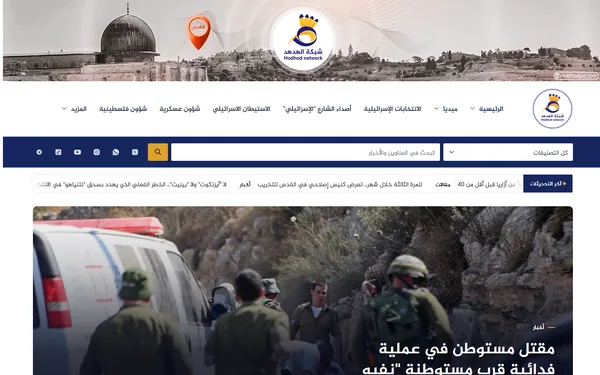
  • Hodhod front pageHodhod الهدهد
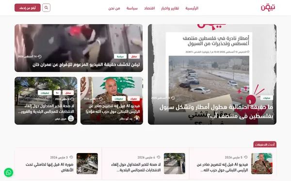
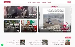
  • Tayaqan front pageTayaqan تيقن
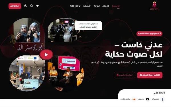
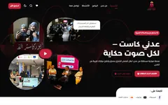
  • Adeni Cast front pageAdeni Cast عدني كاست
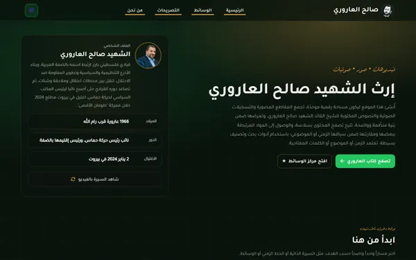
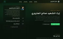
  • Saleh Al-Arouri Archive front pageSaleh Al-Arouri Archive أرشيف صالح العاروري
Six of the 24 sites. Same codebase and same modules; the themes, the languages and the switched-on modules differ.
Quds News Network's front page on a phone: the lead story over a photo, then a list of headlines with thumbnails.
Quds News Network at phone width. Its front page is assembled from the same modules as the others.

The decision. A site may differ in configuration, not in behaviour. Every newsroom runs the same modules and the same code; what changes is the theme, the languages and which modules are switched on.

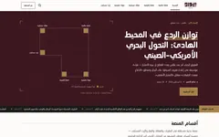
One theme, from a six-page brand book: IWAD

  • Maroon#3D1720Primary surfaces and headings
  • Gold#A8824AThe mark only: squares, borders, large type
  • Gold for text#7E5F31Any gold text, 5.03:1 on paper
  • Paper#F0EDE6Editorial surfaces
  • Cream#F3EEEAText on maroon
  • Ink#1A1A1ABody text

IWAD, a defence research institute, came with a logo, clear space and six colours. The type scale, spacing, components and section colours were designed from those. The brand gold is 3.02:1 on paper, which fails for text, so it only marks things and a darker gold carries every gold word.

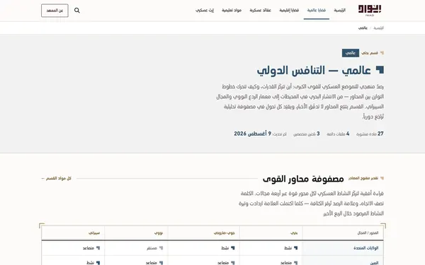
  • The Global section hub, in its #33526B accentGlobal #33526B 7.02:1
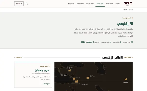
  • The Regional section hub, in its #2F5D53 accentRegional #2F5D53 6.39:1
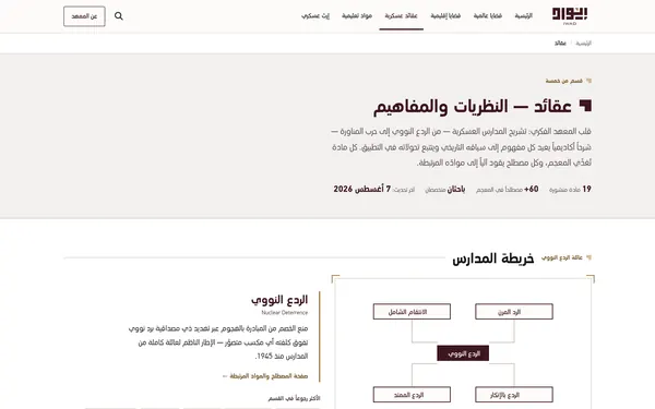
  • The Doctrine section hub, in its #3D1720 accentDoctrine #3D1720 13.39:1
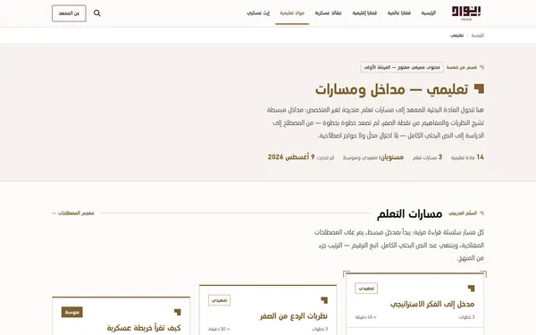
  • The Education section hub, in its #7E5F31 accentEducation #7E5F31 5.03:1
  • The Heritage section hub, in its #5C4632 accentHeritage #5C4632 7.56:1
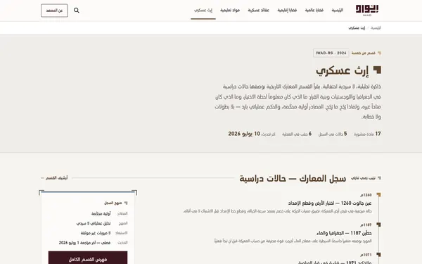
The five section hubs, captured from the theme build with its sample content. They share one layout and one set of components; each gets its accent, checked against the paper, and a module of its own: a matrix, an atlas, a map of schools, learning paths, a record of battles.

Twenty-four forks

Newsrooms used to be built one at a time, each a fork of the last. A fix in one site never reached the others, and every new client meant weeks of repeated work.

Modules, themes and switches

Front pages are built from shared modules: a breaking strip, a lead story, a headline rail, an audio briefing, podcast and translation sections. Editors switch them on per site. A new feature starts switched off everywhere and is turned on for one site in the same commit that writes it, so the question of who gets it is answered before it ships.

A theme from a brand book

IWAD is one of the themes: a research platform for a defence institute, 24 pages, right to left. The brand book was six pages and had no type scale, spacing or components, so those were designed first, in two written documents, and the pages were built on them. Sections are told apart by colour instead of icons, because anything military reads as combat. It is live at wardefense.institute.

A panel that shows only what a newsroom uses

The editorial panel works in Arabic, English and Turkish, right to left by default. Switching a module off removes its route, its sidebar entry and its permission together, so an editor never meets a menu item that leads nowhere. Every label is a translation key, 5,874 of them, checked before each commit.

Small details, decided once

Share previews run through one controller for every site. The site name is not added to the title, because WhatsApp and Telegram give the title a single line and the prefix was eating the part of the headline that earns the click. Descriptions stop at 200 characters, which still reads as a full sentence on every platform.

Checks for what nobody can see

Some failures never throw an error: an English string that renders in Arabic because Arabic is the fallback, a share image a crawler quietly refuses, a permission that exists on one route and nowhere else. A teammate wrote a command for each that fails before a commit lands, across 456 Livewire components and 839 Blade views.

Measuring a live newsroom

Maktoob Media, the English site on the platform, felt slow on mobile. Lighthouse against production moved 20 points between identical runs, so before touching the site I built a rig that could tell two builds apart. Fonts went from 749 KB to 78 KB and icons from 302 KB to 31.6 KB. The usual advice, content-visibility on the off-screen sections, measured 84 against 83 and was thrown away.

Result

  • Runs 24 sites, among them Quds News Network, Maktoob Media, Tayaqan, Hodhod, Adeni Cast and the Saleh Al-Arouri archive.
  • Quds News Network, real Chrome users over 28 days: FAST, with LCP at 2.33 s and INP at 104 ms.

What I would do differently

The guard commands came one at a time, later than they should have: each part of the system needed its check first. Writing the check first forces you to decide what correct means, and that was the part that was actually missing.

Kevla Campa

A marketing site for KEVLA CAMPA, a teardrop caravan built as one Kevlar and carbon-fibre shell. It is a design concept, not a launched site: I designed it and wrote all of it by hand, in HTML, CSS and JavaScript with no framework and no build step.

Role
Design and front-end, a concept
Focus
Scroll scenes that explain the shell, motion that stays smooth, accessibility checked
Built with
HTML, CSS and ES modules; no framework, no build step
An 11-second intro, rendered from HTML with the site's own fonts, colours and photos. It opens on the laminate scan from the home page.
imsemoo.github.io/kevla-campa
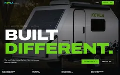
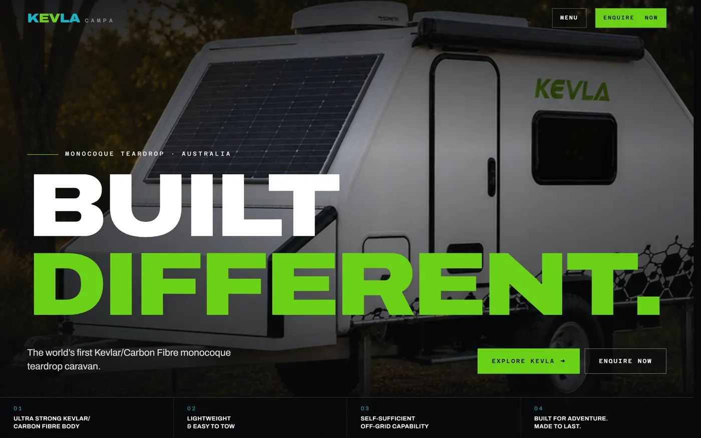
The Kevla Campa home page: the headline Built different. over a photo of the white caravan, with Explore Kevla and Enquire now buttons.
The home page, the first of four pinned scenes. As the page scrolls, the photo drifts and scales under the headline.
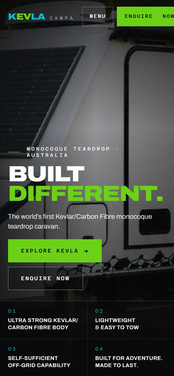
The home page on a phone: the headline, both buttons and the four selling points in two columns.
The home page at phone width. The four selling points drop into two columns.
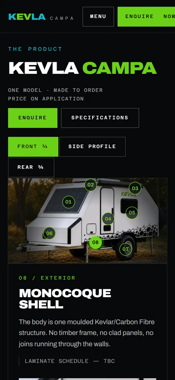
The caravan explorer on a phone: view tabs, the caravan photo with numbered hotspots, and the notes for hotspot 08, the monocoque shell.
The explorer on a phone. The hotspots stay on the photo, and the notes for the selected one sit under it.

The decision. The scroll does the explaining. The home page walks through the shell in four pinned scenes, from the laminate to the places it goes, and each scene is a CSS animation on its own view timeline, not a script listening to the scroll.

The system: a dark shell, one lime accent

  • Ground#07090AThe page, dark by default
  • Surface#0E1214Photo frames, tiles and the explorer
  • Light#EEF0EDThe light sections, set in ink
  • Lime#6BD117Links, focus and selection, 10.2:1 on the ground
  • Cyan#12B7C9Hover and section labels on the dark
  • Cyan on light#076570The same job on light sections, 5.9:1

Archivo carries everything large, widened to between 110 and 118 percent, and Azeret Mono carries the labels, never below 11 px. The cyan falls to 2.1:1 on the light sections, so they get a darker one, and every translucent colour is mixed from these tokens with color-mix().

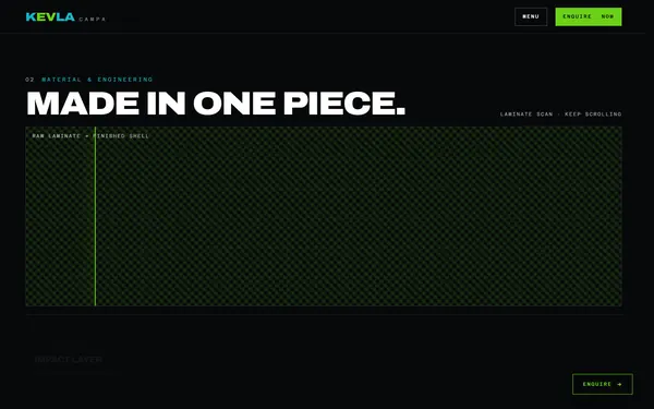
  • The laminate scan part way through: a green line has uncovered the finished white caravan over a raw carbon weave.Home, mid-scroll
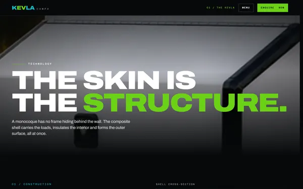
  • The technology page: the headline The skin is the structure, over a close-up of the shell.The Kevla
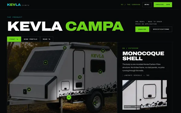
  • The caravan explorer: the caravan photo with eight numbered hotspots beside the notes for the selected one.The Caravan
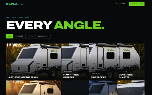
  • The gallery: filter chips for all, exterior, detail and environment above a grid of photos.Gallery
Four of the seven pages: the home page halfway through the laminate scan, the construction page, the caravan explorer and the gallery filters.

Four scenes, one timeline each

The home page pins four scenes: the hero, a scan that turns raw laminate into the finished shell, a track through the places it goes, and a closing call to action. Each one is a keyframe animation on the view timeline of its section, so it runs off the main thread. Browsers without scroll timelines get a small script that seeks the same keyframes, and with reduced motion or JavaScript off the page is a plain, fully visible layout.

Measured before it was changed

The adventure track felt jerky. Rendering held 60 fps, with a 95th-percentile frame of 16.8 ms even at four times CPU throttling, so the fault was the motion itself: each move was squeezed into 12% of the scene and jumped up to 296 px in a frame. The track now rests on each panel and glides over 16% on a sine curve, which cut the jump to 73 px at 1440 px wide and 16 px on a phone, and no headline is ever shown clipped.

What the browser already does

The menu, the enquiry drawer and the gallery lightbox are native dialogs, so focus trapping and Escape come from the browser. They animate out as well as in, and pages crossfade in 220 ms with cross-document view transitions while the header holds still.

Photos that hold still

On the caravan page the hotspots stay locked to the photo at every size, and each one fills the detail panel with its own photo and notes. The next photo swaps in only once it has decoded, so the panel never flashes empty.

Placeholders that say so

The figures from the maker were not supplied, so none were invented: the specification sheet reads Awaiting client figures, the story copy is marked DUMMY, and the phone number sits in a range reserved for fiction. The README lists everything to replace before launch.

Fonts that do not move the page

Archivo and Azeret Mono are self-hosted variable fonts with fallbacks sized from the font files, so the text takes nearly the same space before and after the fonts arrive, and layout shift stays at 0 on every page.

Result

  • A design concept: not launched, and every stand-in on it is marked as one.
  • No axe-core violations across 24 states, every page at desktop and phone widths plus the open dialogs and form errors, and 100 for accessibility, best practices and SEO in Lighthouse on every page, from the runs recorded in the repository.
  • The code, the README and the six motion plans behind the changes are public.

What I would do differently

Put the buttons in the hero on screen sooner. They finish arriving at about 2.35 seconds; the motion audit in the repository noted it and left it for later, and a shorter, regular stagger would fix it.

FreightZone

A local freight marketplace for Australia. Clients post a delivery request, drivers bid, the client picks an offer and pays into escrow, and the driver is paid once delivery is confirmed. I took an existing set of screens and turned it into a complete, testable two-sided product on one design system.

Role
Product designer: UX, UI and the design system
Platforms
iOS and Android, on a 360 x 800 base
Scope
Client app and driver app, 70+ screens and states
A 17-second intro built from the Figma file's own tokens, components, copy and motion rules, ending on its cover. Its middle beat is the case's decision: every bid carries the same five facts in the same place.
Figma, FreightZone App
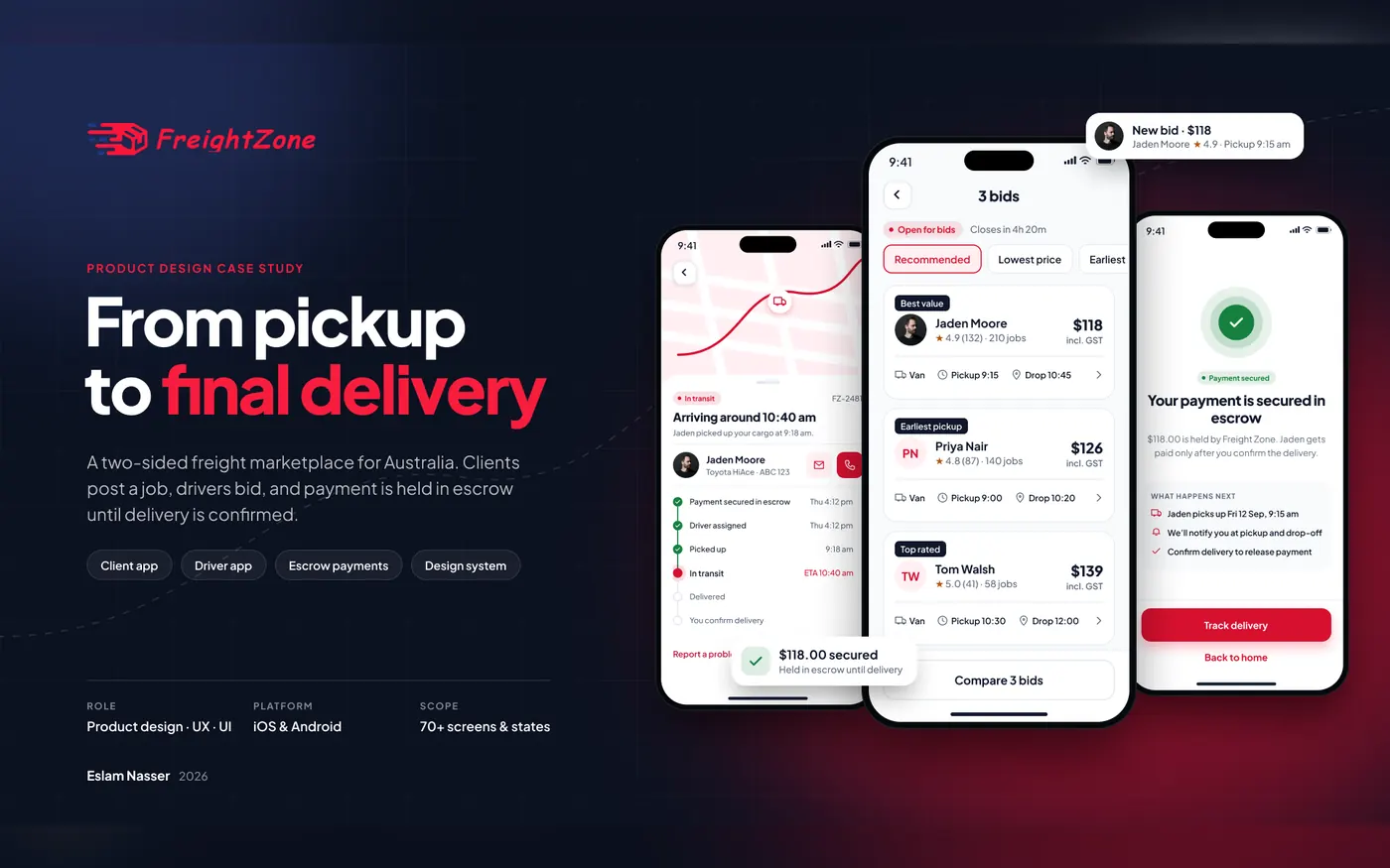
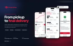
The FreightZone cover: the headline From pickup to final delivery beside three phone screens, a delivery in transit, three bids to compare and a payment secured in escrow.
The cover of the design file: tracking, the bid comparison and the escrow confirmation, three of the 70+ screens and states.

The decision. Every bid looks the same. Clients choose between people and prices, so each bid card carries the same five facts in the same place: price, pickup time, delivery estimate, vehicle and rating. A compare view lines up to three bids in one table and marks the best value in each row.

The system: the client's red, made to pass

  • Brand#D7102FPrimary actions, 5.2:1 under white text
  • Tint#FFF0F2Brand surfaces
  • Text#0F172APrimary text, 17.9:1
  • Secondary#5B6679Secondary text, 5.8:1 on white
  • Success#15803DDelivered and paid, 5.0:1
  • Danger#BE123CErrors and reported issues, 6.3:1

The logo and the red were kept, but the red went from #F81D3E to #D7102F so white text passes WCAG AA. Plus Jakarta Sans runs in 11 styles from Display 32 down to 12 px and never smaller; radius tokens are bound to variables, spacing sits on a 4-point grid with a 20 px screen margin, and icon buttons are at least 44 x 44.

What was wrong

“Get a quote” went straight to payment without ever showing a price, a vehicle or a pickup time. Phone login, an email password reset and Google sign-in sat side by side with no password field anywhere. The same code meant two different things on two screens, a nine-item drawer hid the core tasks, and only the happy path existed.

Who it is for

Senders who want the price and the pickup time before they pay, and independent drivers who want to be verified quickly and to see fare and distance before they accept. Both are proto-personas: there was no research budget, and the file labels them as assumptions.

One journey, both sides

Post, receive bids, compare, select, pay into escrow, track, confirm, get paid. The drawer became four tabs per app, and both apps share one status badge, from Open for bids to Paid out, so the client and the driver always see the same state name for the same job.

Trust at the moment of doubt

Paying a stranger up front is the biggest barrier in the flow, so escrow is explained three times, briefly: when a request is published (nothing is charged now), before a driver is chosen (what happens next) and on the payment screen. Phone OTP is the only sign-in, and only the driver ever types the handover code.

The states, not just the happy path

Loading while a driver is matched, empty lists, a wrong code with attempts left, a declined payment with no charge, offline with the last update time, buttons disabled until a code is complete, and success. Motion appears only where it explains something: the onboarding carousel, sheet transitions and a pulse while a driver is found.

Result

  • A complete Figma file for both apps, 70+ screens and states on one design system, with the case study in the same file.
  • Four hypotheses, each with the metric that would confirm or kill it after launch, from the time it takes to pick a bid to the drop-off between choosing a driver and securing the payment. They are proposals, not results.

Cutaway مقطع

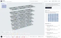
A digital twin of a hospital, built as a concept: six levels of six wings as a 3D model in the browser, replaying one simulated day or following it live, event by event. Beds turn over from occupied to cleaning to ready, rooms warm through HVAC faults, call lights wait too long at shift change and pumps move between rooms. It opens on one wing, pulls out to a level or the whole building, and from any bed finds the nearest free equipment and the walk to it. The whole interface also switches to Arabic, right to left, and another dashboard can put the twin inside itself with one tag, open it on any room and hear its alerts. An operator acknowledges an alert and sends it to the team that owns it, and every overview forecasts the next four hours of ward beds as a range, checked against what the day went on to do. I designed it and built all of it, the simulation included, and every number on it is simulated.

Role
Concept, design and build
Focus
A 3D model that answers one operational question at a time, and stays fast at the scale of a hospital
Built with
React Three Fiber, three.js and TypeScript; compressed glTF; the day simulated in a Web Worker; wayfinding on a graph of the building; a seeded Monte Carlo forecast, backtested; an integration server over MQTT; a real clinic read from IFC at build time
A 58-second recording of the live demo, captured frame by frame on a fixed clock: the opening shot, the four layers, room 4A09 heating past its limit through the afternoon, the walk to the nearest free pump in the next wing, the whole hospital drawn apart, level 4 in 3D and as a plan, the interface turning to Arabic, and a mock operations page that frames the twin, opens a room in it, plays the day and hears each alert as it opens.
imsemoo.github.io/cutaway/?select=4A09&t=21:00
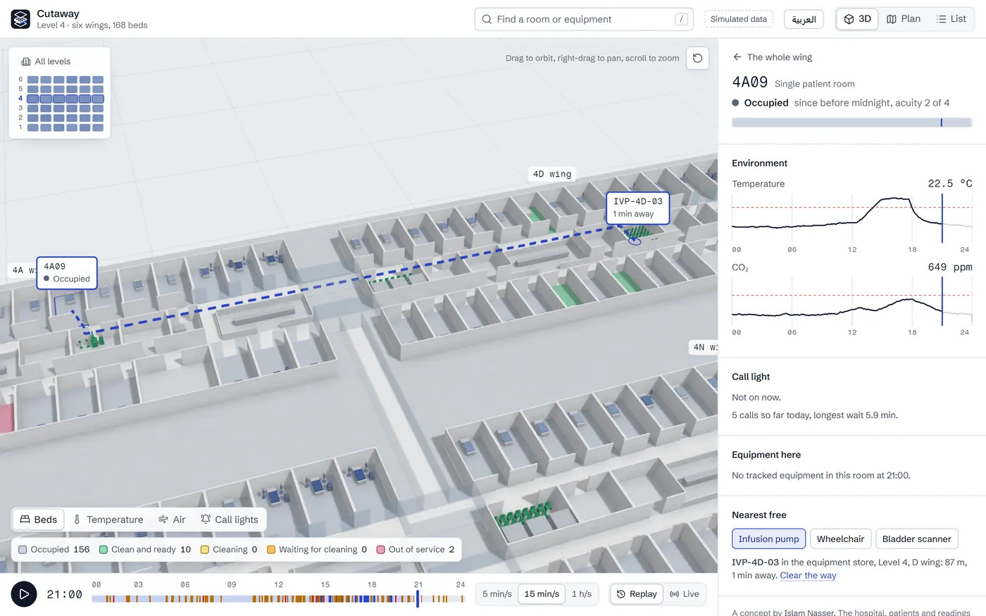
Level 4 in 3D with a dashed blue line from room 4A09 along the corridor and across a glazed link to a pump in the next wing, tagged 1 min away, beside the room's panel.
At 21:00 no pump is free in 4A09's own wing. The nearest is in the next one, and the walk is drawn down the corridor and across the glazed link: 87 m, about a minute.
imsemoo.github.io/cutaway/?building=clinic
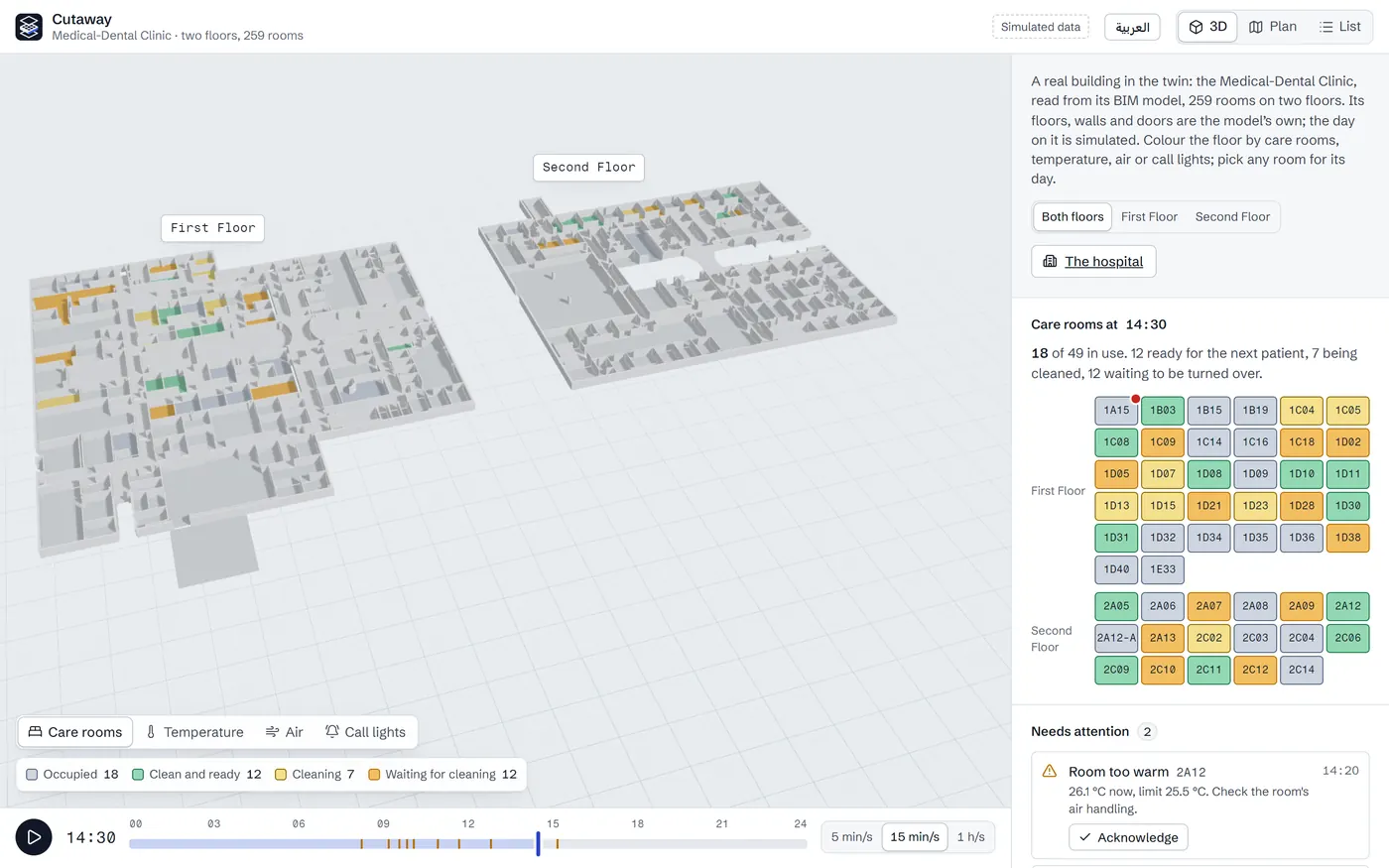
The clinic in 3D: its two floors side by side, each labelled, the care rooms coloured by state, beside a panel with the board of its 49 care rooms and the switch between its floors.
buildingSMART's Medical-Dental Clinic, read from its IFC model: both floors at 14:30, 18 of its 49 care rooms in use, and the day's alerts in the panel. The plan is the building's own; the day on it is simulated.
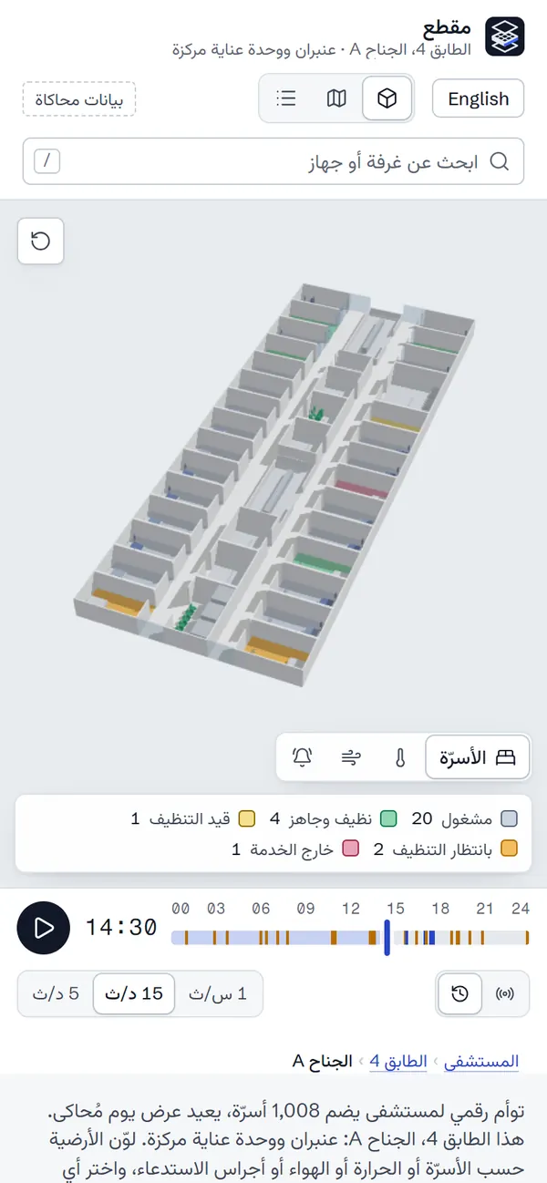
Wing 4A on a phone in Arabic: the top bar, the layer switch and its key right to left above the model, turned lengthwise, and the timeline.
At phone width a wing turns lengthwise to fit the screen. Here in Arabic: the bar, the layers and the key read right to left, and the timeline still runs left to right.
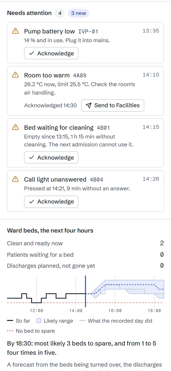
Wing 4A's panel on a phone at 14:30: four alerts, the warm room's acknowledged with a button to send it to facilities, and below them the next four hours of ward beds as a stepped line, a shaded range and a sentence.
The warm room's alert, acknowledged at 14:30, with its next step: send it to facilities. Below, the next four hours of ward beds: 2 ready now, and by 18:30 most likely 3 to spare, 1 to 5 four times in five.

The decision. The floors carry the data, one question at a time. A layer colours every room, in one wing or across all six levels, by bed state, temperature, air or call-light wait, with its key beside it, on a white model that never competes with the colour. In temperature and air a room shows its own sensor and only the corridors, which have none, are estimated, from the doors that open onto them. Picking a room flies the camera to it and opens that room's day beside the model.

The system: an architect's white model, data on the floors

  • Ground#E8ECF0The drafting ground under the model
  • Model#FBFBFCWalls, beds and fixtures, the white model
  • Ink#2A3441The walls in plan view, cut and inked
  • Blue line#2946C7Selection, focus and actions, 7.5:1 on white
  • Ready#157A4CA clean bed; its soft tint fills the floor
  • Waiting#B86E00A bed waiting for cleaning, and warnings

Schibsted Grotesk carries the interface, Vazirmatn its Arabic, and Fragment Mono the room numbers, times and readings, with tabular figures. Every status comes in two strengths: a strong one for chips and icons in the panel, a soft one for the floors, so the model stays white and colour always means data. Temperature and air get their own ramps, with the key beside the model.

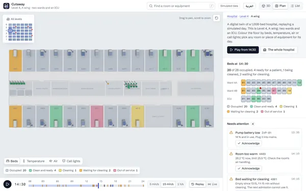
  • A wing as a plan: walls cut and inked, rooms coloured by bed state.Plan view
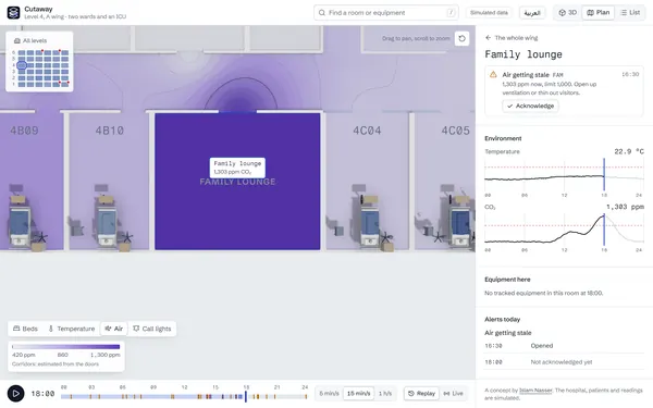
  • The plan coloured by CO2 at 18:00, the family lounge darkest and its stale air estimated spilling into the corridor outside its door, its alert in the side panel.Air at 18:00
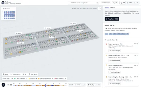
  • Level 4 in 3D: six wings on one plate, joined by glazed links, each named.Level 4
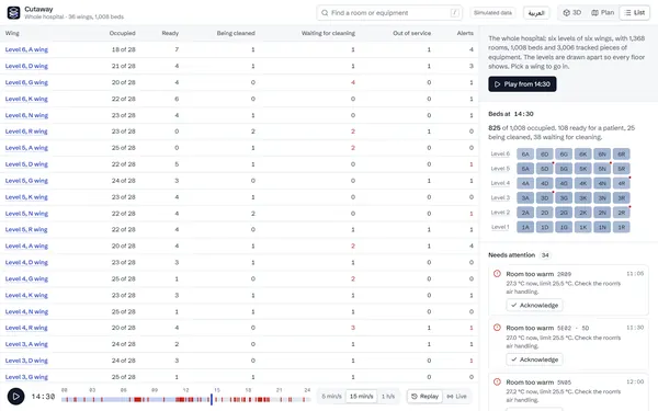
  • Every wing in a table: beds occupied, ready, being cleaned, waiting and out of service, and its open alerts.List view
Four views of the same day: a wing as a plan drawing, the air layer at 18:00, level 4 with its six wings, and every wing of the hospital in a table.

A day that behaves like a ward

The simulation is written to tell a ward's afternoon: discharges cluster late in the morning and admissions arrive through the evening, so beds sit dirty, then in cleaning, then ready and waiting. Rooms warm through HVAC faults, the family lounge gets stuffy in visiting hours, pumps run low until someone plugs them in, and call lights wait longer at shift change. Each of the 36 wings runs from its own seed, so every visitor replays the same day and one wing's day never shifts another's; wing 4A, where the demo opens, keeps a scripted story on top. It all runs in a Web Worker, and the wing on show arrives first, in under 30 ms, with the rest of the hospital under a second behind.

From one wing to the whole hospital

The model works at three scales. A wing is two wards and an ICU, close enough to read a bed. A level puts its six wings on one plate, joined by glazed links. All levels draws the six floors apart, an exploded section of the building, each coloured by the same layer, so a warm room shows from across the hospital. A map of the building sits beside the model, every wing shaded by how full it is and marked where something critical is open; a click on a wing flies into it, and a trail above the panel leads back up. The camera fits each scale by projecting its corners through a trial camera, so the model always clears the overlays, and the address bar keeps the scale, view, layer, time and selection, so every view is a link.

The drawing and the model are one scene

Plan view does not swap in a flat map. Every wall sinks to a section cut 15 cm above the floor and darkens to ink, so the model turns into the architect's drawing and back, for a wing or a whole level, and the first load plays the same move the other way: the plan rises into the building. List view carries the same data as a table, for keyboards, screen readers and anyone who wants to scan.

A real building, from its BIM model

Every wing of the demo hospital is built to one plan, and no real building is. So the twin also reads one: buildingSMART's Medical-Dental Clinic, a real two-storey clinic published for testing as a 13 MB IFC file. At build time the IFC is read in Node and each room's outline is cut from its own mesh, with its name, its category and the area the model states; the page loads 34 kB of outlines, walls and doors, and never the parser. The check is the model's own figures: the model measures a room to the middle of its walls, and once that half wall is counted, 258 of the 259 rooms are within 5% of the area it states. The clinic opens from a link with the same layers, views, alerts and languages, and a simulated day on its own rooms, replayed or live: the integration server serves it as a building of its own, under its own topics, by its own rules, on a feed of its own.

The nearest free pump, and the walk to it

From any bed, Nearest free finds the infusion pump, wheelchair or bladder scanner, or from an ICU bay the ventilator, that is quickest to reach on foot anywhere in the hospital. The walk runs on a graph of the building, 4,296 points: every room and its door, both corridors of each wing, the crossing through the core, the glazed links and the lifts. Costs are seconds, 1.2 m/s on foot and a lift as a wait plus a few seconds a floor. The question has many possible answers, so one Dijkstra search from the room reaches them all, where A* would need a search for each pump; a search takes 2 to 11 ms. The walk is drawn over the walls, the view widens to the level or the building to hold it, and the search loads only when someone first asks, as its own 1.4 kB file.

Alerts that know only the present

An alert keeps only what was known when it opened, and it is worded at the minute on the timeline: pressed at 14:21, nine minutes without an answer. Scrub to any time and nothing gives away what happens next. Severity is read at that minute too, so a warming room turns critical only once it passes 26.5 °C.

Alerts someone can answer

An operator acknowledges an alert and sends it to the team that owns it: facilities for a warm room, nursing for an unanswered call light, housekeeping for a bed waiting to be cleaned, bed management for a clean bed with no patient. The alert still clears only when its condition does. In alarm management, acknowledging belongs to the operator and clearing to the process, so no button pretends to cool a room. Each action joins the day with its minute: scrub back before an acknowledgement and the alert is new again, and each room keeps a log that says when an alert cleared before anyone acknowledged it. Live, an action goes to the server and comes back to every screen as an event. One taken while the server is down waits in an outbox and arrives once the connection is back, logged once however often it is sent, which a browser test checks through the demo's own outage.

The next four hours of ward beds

Every overview forecasts how many ward beds will be free in the next four hours, net of the patients waiting for one: a likely number, and a range meant to hold four times in five, drawn beside the last four hours. It is made only from what is known at that minute, the beds being cleaned, the discharges the morning round planned and the usual pace of admissions, and a test checks it: built from the live feed up to a minute and from the whole recording, the two forecasts must match. A backtest makes it every half hour in every wing and compares it with what the day went on to do. The first version looked right on screen and held its range half the time; the backtest found the two faults behind that.

In English or Arabic

A switch in the top bar turns the whole interface to Arabic, right to left, and a link can open it that way. The layout mirrors, the panel moving to the left of the model and the overlays trading sides, while time and scales keep running left to right, as in a media player: the timeline, the charts, the colour ramps and the map of the building. The alerts are worded in Arabic with its six plural forms, and the room names are set in Arabic on the floors. Vazirmatn was chosen by setting the interface's own text in six Arabic faces beside Schibsted Grotesk. It and the Arabic catalogue load only for an Arabic visit, and a test that parses the source fails if the catalogue misses a string the interface says.

Live, from a stream of events

Live mode builds the hospital from events as they arrive instead of from a recorded day. A mock server in a Web Worker plays the day over the JSON protocol a real integration server would use, a simulated minute each second, and the page folds each event into the same day the views already read, so none of them had to change. Sequence numbers keep the stream whole: when the connection drops, the page says the floor is stale, waits longer before each retry, and asks for only the events it missed, from the last 2,000 the server keeps. A test replays the whole day as events and checks that it reads exactly like the recording at every five-minute reading.

From a hospital's own systems

A hospital's systems do not speak the twin's feed: building sensors, bed status, nurse call and location tags each speak their own protocol, and most can reach MQTT through a gateway. So an integration server stands between them. It subscribes to one topic per room, asset and flow, checks every message, gathers readings into one frame every five minutes and works out every alert itself, by the same limits the simulation uses, then serves the feed the page already reads. One command runs a whole simulated hospital on one machine, and the clinic beside it: a broker, the systems publishing the day as raw messages, a server for each building and the twin. A test publishes the whole day, 1,005,153 messages, and the server must turn them into exactly the recorded 21,904 events with all 881 alerts, which it is never given.

Inside another dashboard

A twin rarely has the screen to itself, so any page can embed this one: one script of 1 kB and one tag, <cutaway-twin at="level-4">. The page talks to the twin in the words a link already uses. It opens a room, a layer or a minute and plays the day, and it hears what someone selects, the alerts open and each alert as it opens, worded in the twin's language. The twin runs in an iframe, so its React, three.js and WebGL never meet the host's own framework or styles, and after a handshake it takes commands from that one origin and reports only to it. Every command is checked by the same function that reads a link, and one it cannot take comes back as an error by name. A mock operations page shows it working, and a browser test embeds the twin in a page on another origin, moves it and listens to it.

By keyboard and screen reader

The model is one stop in the tab order. The arrow keys move between rooms, or between wings in a level or the whole hospital, by what lies that way on screen, so they mean what the eye sees however the camera has turned; Enter opens one and Escape steps back out. The cursor lights the floor and shows the tag a pointer would, and each move is said aloud: Patient room 4A09, occupied. Alerts that open while the day plays or streams live are said too, gathered a few seconds at a time so a fast replay does not bury the listener. The list view carries the same floor as a table. On every push, axe-core checks eight views a link can open against WCAG 2.2 A and AA at desktop and phone size; its first run found one violation, repeated on every view, and it was fixed.

Fast because it draws less

The canvas renders only when something changes, so an idle hospital costs no GPU time. Every wing is built to one plan, so each part of the shell is one instanced mesh for all 36 wings, and the 1,368 room floors are one more, which is also the pick target. Only what is in view is packed into what the GPU draws: the first build of the hospital hid the other wings but still sent them to the GPU, 207,000 triangles for one wing, and packing brought that back to 15,000. Beds, patients, bedside furniture and equipment are glTF models, 17,208 triangles compressed to 129 KB, drawn as instances with a shader that tints only the parts that carry state, such as a blanket or a pump's housing. Each switches to a plain proxy by its distance from where the camera looks, and to a box in the whole-hospital view, which draws in 33 draw calls, fewer than one wing up close. The corridors' temperature and air are estimated in the fragment shader, from each wing's 38 doors weighted by how wide they are, with isolines and the alert limit drawn from screen-space derivatives; switching that layer on costs 1 or 2 fps.

It adapts, recovers and is tested

Quality adapts to the device: four levels, from ambient occlusion with SMAA down to plain rendering at a lower pixel ratio, stepped by the frame rate measured while the scene moves. If the graphics driver resets, the view says it has paused and rebuilds itself, tested both with the effects already running and with them arriving after the loss, a race CI caught. Every push runs 113 unit tests, 30 browser tests with real WebGL at desktop and phone size, accessibility checks of twelve views, lint, types and a size budget for each bundle, and a failure stops the deploy.
Result

  • A concept: the hospital, the patients and the readings are simulated, and the page says so on every view.
  • Live on GitHub Pages, with the code public. What paints the interface loads first, at 89.7 kB gzipped; the scene and three.js follow at 217 kB and 99 kB, then the models at 129 KB. Ambient occlusion and SMAA load last, at 157 kB, and only when the quality level uses them. The alert list, the forecast and a room's details arrive just after the first paint, the wayfinding search, live mode and the Arabic catalogue on first use, and the embed's side only inside a frame.
  • Measured in September 2026 on an integrated Intel GPU at 1280 by 800, orbiting with ambient occlusion and SMAA, over three runs: the whole hospital at 72 to 90 fps in 33 draw calls, a level at 74 to 90 fps, one wing at 69 to 81 fps in 43, and close to a room at 61 to 77 fps.
  • The forecast, backtested against the simulated day: four hours ahead, each wing's range held 93.6% of the time and missed by 0.68 of a bed on average; over twelve other simulated days, the whole hospital's held 80%, as a range meant for four times in five should.

What I would do differently

Test on a range of real devices. The frame rates here come from one laptop and emulated phones, and a low-end Android phone is the test it still needs. The keyboard model, too, should be tried by someone who uses a screen reader every day, not only by automated checks. And the forecast should meet a real hospital's history: here it knows the simulation's own averages, so the backtest measures how well it reasons from them, not how well it would learn them.

Five more, briefly.
An Arabic media theme drawn on one line, a marketplace built from someone else’s design, a pitch to a Swedish van dealer, thirty-odd pages from a Figma file, and a charity site I designed from scratch.

taktek-dev.github.io/watad-theme
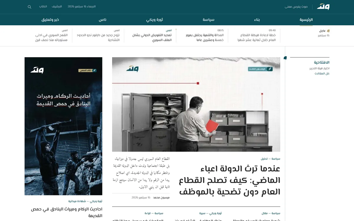
Watad website

Watad وتد

Arabic media theme. UI design from the brand identity, and the front-end.

A new front-end for watad.media, an Arabic site of analysis, news and a revolution wiki: eleven page templates in plain HTML, CSS and JavaScript, ready to be cut into Blade. Every page hangs on one line, the axis, and since the name means a peg, the motion drives one into it.

Notes from the build
  • One line runs down every page between the rail and the body. The six brand marks sit on it as wedges, and nothing else touches it.
  • On load the axis draws itself and the wedges drop into place. Posters lift off the wall on hover and are always shown whole, never cropped or zoomed.
  • The client's revisions are built in: an archive by month and year, page numbers on every list, a sections row that stays in view, and a news timeline whose posts open in a popup with their own address.
  • The 45 writers from the live site can be searched by name or field, and the search treats the different forms of alef, taa marbuta and yaa as the same letter.
  • The brand grey went one step darker so 12 px dates reach 4.5:1. The sand numerals stay below AA as a brand decision, written down for the client.
ozcar.com.au
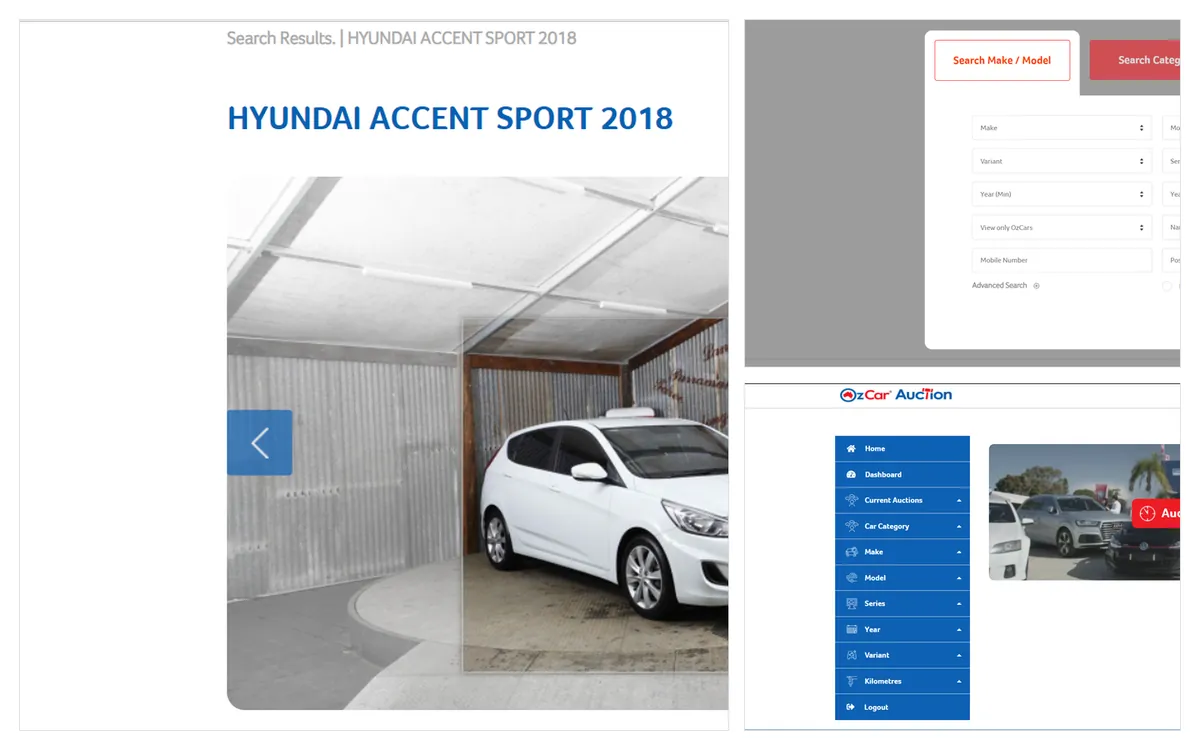
OzCar website

OzCar

Used-car marketplace. Front-end, built from Adobe XD designs.

A used-car marketplace and an auction dashboard for an Australian dealer group. The designs came as Adobe XD files, and every screen had to become markup a back-end team could wire up without redrawing anything.

Notes from the build
  • Make and model search with dependent filters, the vehicle page with its finance calculator and live video request, and the reviews and dealer pages.
  • The auction side as its own application shell: a left navigation of filters (make, model, series, year, variant, kilometres) driving a dashboard of upcoming auctions.
  • The same card, filter and form patterns repeat across both sides, on a small SCSS component layer over the Bootstrap grid.
  • Filters and calculators work as plain forms first, and jQuery adds the live behaviour on top.
  • The public site is limited to visitors in Australia, so the image shows the screens as they were built.
code on GitHub
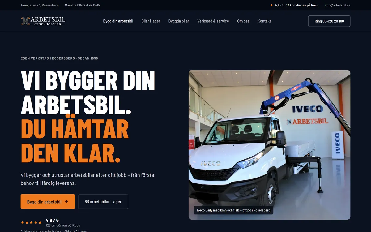
Arbetsbil Stockholm website

Arbetsbil Stockholm

Design proposal. Design and a clickable prototype, desktop and mobile.

A pitch to a Stockholm work-vehicle dealer: a new site designed as a clickable prototype at 1440 and 390, with the dealer's own photos, stock and prices. Made unasked and labelled as a proposal. Not production code.

besaeg.com
BESA website

BESA

Study-abroad platform. Front-end from Figma, 30+ hand-built pages.

University search, pathway programmes, destination guides, scholarships and registration for education fairs. The designs came from Figma, and I built more than thirty pages from them by hand.

yedibasak.uk
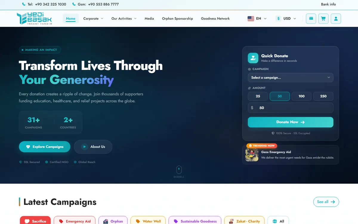
Yedi Başak website

Yedi Başak

Charity site. UI design, front-end and the Laravel back-end.

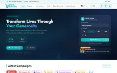
Campaigns, quick donations, sponsorship and giving in several currencies, for a UK aid charity. I designed the interface from scratch and built it, the Laravel back-end included.

Every site, and what I did on it.

46 projects, 36 with a public link. Filter by the kind of project you have in mind and by what you need. Rows marked Case study or In brief open on this page; the rest open the site, or the code where that is public.

Project type
What you need

46 shown

  1. Mo3ta معطىCase studyPalestine information centrePalestine
    Design, front-end and back-endLaravelInertiaVue 3ArabicVisit
  2. Devlo CMS ديفلوCase studyNewsroom platform running 24 sitesTürkiye, Palestine, Yemen
    Design, front-end and back-end; product owner of the front-endLaravelLivewireMySQLArabic and EnglishVisit
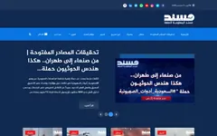
  3. Musnad مسندNews and claim verificationYemen
    Design, front-end and back-endLaravelLivewireSchemaArabic
  4. Quds News Network قدس الإخباريةIn the Devlo case studyPalestinian news networkPalestine
    Design, front-end and back-end, on Devlo CMSLaravelLivewireRTLArabicVisit
  5. IWAD إيوادIn the Devlo case studyDefence research institute
    UI design from the brand book, the design system and the front-endHTMLCSSJavaScriptArabicVisit
  6. Kevla CampaCase studyCaravan maker, a design conceptAustralia
    Design and front-end, not launchedHTMLCSSES modulesEnglishVisit
  7. FreightZoneCase studyFreight marketplace, client and driver appsAustralia
    Product design: UX, UI and the design systemFigmaDesign tokensAuto layoutEnglishVisit
  8. Cutaway مقطعCase studyHospital digital twin, a concept
    Concept, 3D, interface and buildReact Three Fiberthree.jsglTFArabic and EnglishVisit
  9. Watad وتدIn briefArabic media site
    UI design from the brand identity, and the front-endHTMLCSSJavaScriptArabicVisit
  10. Qasioun Center for Studies مركز قاسيونStrategic studies centreSyria, Türkiye
    Design, front-end and back-endLaravelLivewireBilingualArabic and English
  11. OzCarIn briefCar marketplace and dealer groupAustralia
    Front-end, built from Adobe XD designsHTMLSCSSJavaScriptEnglishVisit
  12. CalimeroCalimero Pizzaservice, restaurant and online orderingGermany
    Front-end, in a team, over a yearNext.js 14TypeScriptTailwindGerman and English
  13. TooloraMy own product, in development
    Design, architecture, front-end and back-endLaravel 13Vue 3TypeScriptEnglish
  14. Ahsebli احسبليMy own productSaudi Arabia, Gulf, Egypt
    Design, build and everything elsePWAService workerSchemaArabic
  15. Matn متنMy own CMS for hand-built sites
    Design, front-end and back-endCakePHP 5PHPUnitPHPStanArabic and English
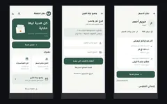
  16. Nuqta Ledger دفتر النقطةMy own Android appEgypt
    Product design and the build, in FlutterFlutterDriftRiverpodArabic
  17. Arbetsbil StockholmIn briefWork-vehicle dealer, a design proposalSweden
    Design and a clickable prototype, desktop and mobileHTMLCSSJavaScriptSwedish
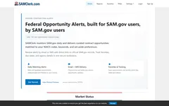
  18. SAMClerkUS federal contracting intelligenceUSA
    Front-endHTMLCSSJavaScriptEnglish
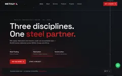
  19. MetalyolStructural steel supplier and contractor
    Front-end and motionHTMLCSSJavaScriptEnglish
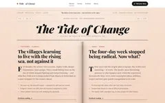
  20. The Tide of ChangeIndependent voices microsite
    Front-endHTMLCSSJavaScriptEnglish
  21. Al-Jarmaq الجرمقPalestinian media networkPalestine
    Design, front-end and back-endLaravelLivewireRTLArabic
  22. Yedi BaşakIn briefHumanitarian aid charityUK
    UI design, front-end and the Laravel back-endLaravelBladePaymentsEnglishVisit
  23. Tayaqan تيقنCommunity verification platformPalestine
    Design, front-end and back-end, on Devlo CMSLaravelLivewireRTLArabic
  24. Maktoob MediaIn the Devlo case studyIndependent outlet on rights and minoritiesIndia
    Front-end from Figma, then the performance and security pass, on Devlo CMSLaravelLivewireFigmaEnglishVisit
  25. BESAIn briefStudy-abroad platformEgypt, UK
    Front-end from Figma, 30+ hand-built pagesHTMLSCSSJavaScriptEnglishVisit
  26. Hodhod الهدهدPalestinian news networkPalestine
    Front-end and back-end from Figma, on Devlo CMSLaravelLivewireFigmaArabic
  27. Adeni Cast عدني كاستIndependent podcast platformYemen
    Design, front-end and back-end, on Devlo CMSLaravelLivewireAudioArabic
  28. Design and front-end, on Devlo CMSLaravelBladeRTLArabic
  29. HandsOnTVMedia and streaming organisationUK
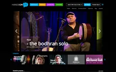
    Front-end from Adobe XDHTMLSCSSJavaScriptEnglish
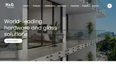
  30. Hardware & GlassArchitectural glass-hardware supplierUSA
    Front-end, hand-builtHTMLSCSSJavaScriptEnglish
  31. BHF CouriersCourier companyAustralia
    Front-endHTMLSCSSjQueryEnglish
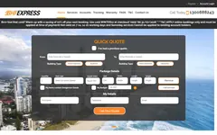
  32. CourierNowCourier bookingAustralia
    Front-end from Adobe XDHTMLSCSSJavaScriptEnglish
  33. Hive StudioCreative studioSaudi Arabia
    WordPress, bilingualWordPressElementorArabic and English
  34. IDD 2023Desalination conferenceSaudi Arabia
    WordPress, bilingualWordPressElementorArabic and English
  35. Yassiru يسّرواMarriage-support platform
    Front-end and back-end, open sourceLaravelVueDockerArabic
  36. YottasrcWeb-hosting provider
    Front-end, open sourceHTMLSCSSJavaScriptArabic and English
  37. Creatives DashboardDashboard UI kit
    UI, open sourceHTMLCSSJavaScriptEnglish
  38. Skills BeyondDriving schoolAustralia
    WordPressWordPressEnglish
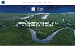
  39. Infinity Blue BarramundiBarramundi farmAustralia
    WordPressWordPressElementorEnglish
  40. Power Line EgyptEngineering and contractingEgypt
    WordPressWordPressEnglish
  41. Abaad Future أبعاد المستقبلEvents and exhibitions companySaudi Arabia
    WordPressWordPressArabic
  42. VisaOmanTravel visa serviceOman
    WordPressWordPressEnglish
  43. BurujQuran learning for children
    Front-endHTMLSCSSJavaScriptEnglish
  44. IntimeDevSoftware agencyEgypt
    Front-endHTMLSCSSAOSEnglish
  45. Al-Mohajer المهاجرNews for migrants and refugeesEgypt
    Front-end, six page templatesHTMLBootstrapRTLArabic
  46. ThreadStudioGarment customiser, a demo
    Front-end with a small PHP APIHTMLCSSJavaScriptEnglish

How a project runs.

The same six steps for a landing page or a platform. Every step ends with something written down or measured.

  1. 01

    Brief

    You send the goal and whatever exists: content, a brand book, a Figma file, the current site. I send back questions in writing, so the decisions are on record for your team.

  2. 02

    Structure

    Flows, the page list and what each screen has to do. On Arabic and bilingual products this is also where right to left gets decided, before any layout.

  3. 03

    First screen

    One screen, designed and agreed before the rest exists. If the direction is wrong, we lose a day.

  4. 04

    Build

    Components first, then pages, delivered in stages you can review. The same person designs it and writes the code, so there is no handover to lose things in.

  5. 05

    Measure

    PageSpeed on both devices, accessibility checks and a pass at 375 px before anything is called finished. The tables below are this step, still running.

  6. 06

    Keep it running

    Most of my work lands in systems that already run. I read the existing code before I change it, and keep what works.

The numbers update every Monday.

A GitHub Action runs Google’s PageSpeed API against these sites each week, keeps the median of three runs per device and commits the result to my profile. This section reads those files, so a bad week shows up here too.

Showing the committed numbers from 21 September 2026.

Raw JSON on GitHub

Musnad

Run it yourself
PageSpeed scores for musnadye.com
DevicePerfA11yBestSEOLCP
Mobile991001001001.9 s
Desktop991001001000.5 s

Median of three runs per device, Lighthouse 13.4.1.

Musnad is here for its technical side. Pages render on the server, the pagination stays crawlable, and my SEO and AI-search audit of the live site, 20 findings ranked by impact, became the plan for its next release, ClaimReview structured data included.

Quds News Network

Run it yourself
PageSpeed scores for qudsn.co
DevicePerfA11yBestSEOLCP
Mobile84100961003.9 s
Desktop9397961001.0 s

Real Chrome users over 28 days: FAST, LCP 2.33 s, INP 104 ms.

This page

54 KB of CSS inlined in the HTML and 35 KB of my own JavaScript. No framework and no third-party scripts. 12 requests before images and fonts, three of them for the tables above. Built 11 October 2026 from one JSON file by a Python script.

The same weekly job measures it: performance 100 on mobile and 100 on desktop, with accessibility, best practices and SEO at 100.

Lighthouse scores out of 100. Under 90 is marked in brown. LCP is how long the largest thing on the first screen takes to appear.

Who you would be working with.

I’m Islam, sometimes written Eslam. I lead UI/UX and front-end at TakTek, where we build Devlo, Matn and the newsroom sites that run on them, and I take freelance projects alongside.

Most of what I design has to carry real information: statistics that need a source, verdicts that should be read in a second, Arabic headlines sitting next to English ones. I’d rather settle the structure early and in writing, and I check every screen at 375 px before I call it done.

Based in
10th of Ramadan City, Egypt. UTC+2, working remotely
Languages
Arabic, native. English: C1 reading and writing, conversational speaking
Role today
UI/UX and front-end team lead at TakTek, freelance alongside
How I work
In writing: briefs, staged deliveries and reviews in text, with replies within a few hours

Where the seven years went

  1. 2024 to nowTakTek, UI/UX and front-end team lead. Devlo CMS, Matn and the newsroom sites that run on them. My own products on the side: Ahsebli, and now Toolora.
  2. 2020 to 2025IntimeDev, outsourced to SilverTrees. Front-end from XD and Figma for clients in Australia, the UK and Egypt.
  3. Before 2020Freelance front-end and WordPress, mostly for Arabic businesses. Still on Mostaql, rated 5.0.

What I work with

Design

  • Figma
  • Design systems and tokens
  • Arabic typography
  • Prototypes in HTML

Front-end

  • HTML, CSS, SCSS, Tailwind
  • JavaScript, TypeScript
  • Vue 3, Inertia
  • React, Next.js
  • Accessibility checks with axe

Also

  • Laravel, Livewire and CakePHP when a project needs a back-end
  • WordPress with ACF
  • Core Web Vitals, structured data
  • Git, GitHub Actions, PHPUnit, PHPStan
  • AI-assisted drafts, reviewed line by line

This page runs on one token file

Every colour, size and gap here comes from tokens.css. These are the ones doing most of the work. Read the source.

--ink#0f1115
--paper#ffffff
--accent#0b6e4f
--accent-on-ink#5fd3a5
Bricolage Grotesque Schibsted Grotesk for reading, 16 px on a 1.6 line. Fragment Mono for figures 0123456789

What clients wrote afterwards.

Published reviews from Upwork and Mostaql, quoted as written. 100% job success on Upwork, and a 5.0 rating on Mostaql.

“Islam is a superstar. I wanted to elevate a site for a product launch and his combined design and marketing hooks were exceptional.”

Upwork client, business homepage redesign

“He understood the scope immediately and implemented everything in a clean, structured, and future-proof way.”

Upwork client, landing page and bond calculator

«كل الشكر لك أخي الفاضل إسلام. احترافية وإخلاص وجودة تستحق الإشادة، ولن أتردد بالتعاون معك مستقبلا.»

زيد ا.، عميل على مستقل

“He understood the requirements well and was reliable, helpful, and solution-oriented throughout the implementation.”

Upwork client, ordering interface for a restaurant

«التجربة مرضية لأقصى حد والنتائج تجاوزت سقف التوقعات. الاهتمام والخبرة والجهد أنتجت عملًا مميزًا.»

Nass A.، عميل على مستقل

Tell me what you’re building.

A brief, a Figma file or a link to the current site is enough to start. I reply in writing within a few hours with how I’d approach it, what it would cost and how long it would take.

Hiring for a UI/UX or front-end role? The same address works.